
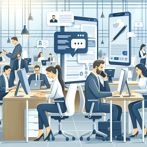
In today’s digital age, creating adaptive design is not just a trendy phrase; it’s a necessity for anyone looking to succeed online. Have you ever tried visiting a website on your phone that was clearly built for desktops? Frustrating, right? That’s where adaptive web design comes into play, ensuring that your site looks great and works perfectly across various devices. With statistics showing that about 57% of all web traffic comes from mobile devices, businesses can no longer afford to ignore this essential aspect of web design.
Let’s consider a small bakery, Baker’s Haven, that struggled to get online orders. Their website was bulky and didnt adjust well to smaller screens, leading to a frustrating experience for mobile users. After ordering adaptive design services from us, they saw:
Another example is a local gym that saw their membership applications double after we optimized their website using adaptive web design. By ensuring their site was functional on all devices, they were able to reach out to a younger audience who primarily used smartphones to enroll in services.
In the world of technology, change is the only constant. The rise of smart devices means design adaptability is crucial. With the average user having over 3 devices, your website must adapt to various screens and resolutions. This doesn’t just mean resizing images; it also involves rethinking layouts and simplifying navigation. The efficiency of adaptive website design maximizes accessibility for everyone, from busy professionals to tech-savvy teens.
Are you ready to elevate your online presence? Here’s why you should order adaptive design from our team:
For a customized quote or further consultation, reach out to our customer relations manager, Arsenii, at +373 601 066 66, or visit us at webmaster.md.
| Service | Price in EUR |
| Logo Development | 250 |
| Brandbook III Development | 1170 |
| Landing Page Development on Wordpress | 1560 |
| Online Store Development on a Wordpress Template | 1500 |
| SEO Promotion - 10 Keywords | 349 |
| Website Support - Medium Package (25 hours) | 450 |
| Email Newsletter - Standard | 359 |
| iOS Mobile Application Development | 7500 |
| Android Mobile Application Development | 7500 |
| Publication to App Store | 800 |

When it comes to building a successful online presence, understanding adaptive design is key. So, let’s break it down: Adaptive design refers to the approach of creating websites that adjust their layout and content based on the device being used to view them. Whether its a desktop, tablet, or smartphone, an adaptive website design ensures an optimal user experience.
Adaptive web design typically employs fixed layouts that change depending on the screen size. Unlike responsive design, which fluidly resizes elements, adaptive design creates multiple versions of a website, each tailored for specific device categories. This means that the site might look completely different on a smartphone compared to a large desktop monitor.
Let’s put this into perspective. Take a local coffee shop that has a website optimized for various devices. When a user visits the site on a smartphone, they quickly find the menu, hours of operation, and contact information. This seamless experience can greatly influence their decision to order online or visit the shop in person!
Another excellent example can be seen in e-commerce websites. A well-known fashion retailer implemented adaptive web design and saw a 30% increase in mobile transactions within months. They recognized that mobile users needed quick access to product categories and an efficient checkout process tailored to their screen size.
Embracing adaptive design can significantly impact your online business success. With professionals who have over 20 years of experience in the field, our team is ready to help you navigate this journey. Whether you need comprehensive support or just a little guidance, we have everything you need under one roof, including adaptive web design, software development, and technical support.
Don’t get left behind in the digital world! Call us today at +373 601 066 66 or visit our website webmaster.md to order adaptive design services that will set your business apart.
When it comes to online business, user experience (UX) is everything. An effective website can mean the difference between a one-time visitor and a loyal customer. Thats where adaptive web design shines, tailoring the browsing experience to fit various devices and user needs. Lets delve into some real-world case studies that show just how creating adaptive design can lead to outstanding results for businesses.
A quaint local restaurant, Gourmet Bites, faced significant challenges in attracting online orders. Their old website design was clunky and barely functional on mobile devices, leading to frustrated customers. After partnering with us to implement adaptive design, they saw the following results:
Fashion House, an e-commerce clothing retailer, approached us for help. They were struggling with high cart abandonment rates. After assessing their needs, we created an adaptive website design that addressed common pain points:
Consider LearnOnline, an educational platform that struggled to keep users engaged. Their non-adaptive website made accessing courses cumbersome, especially on mobile devices. After we implemented adaptive web design, their metrics dramatically shifted:
These case studies exemplify the tangible benefits of adaptive web design. When websites function well across various devices, users are more likely to engage, interact, and ultimately convert.
Is your website ready for an upgrade? Don’t let outdated designs hold your online business back! Partner with our experienced team specializing in adaptive web design. With over 20 years of experience, we offer tailored solutions to fit your unique needs.
⭐ Call us at +373 601 066 66 or visit our website webmaster.md to start your journey towards a user-friendly website today!

With the rising popularity of adaptive website design, misconceptions often surface, leading to confusion among business owners considering a redesign. Understanding what adaptive design truly is—and what it isn’t—is crucial for making informed decisions. Let’s debunk some common myths surrounding this essential web design approach.
This is perhaps the most persistent myth. While both adaptive web design and responsive design aim to enhance user experience across devices, they employ different techniques. Responsive design uses fluid layouts that adjust seamlessly to any screen size. In contrast, adaptive design relies on predefined layouts tailored for specific devices, ensuring optimal presentation and functionality. Think of it like a custom suit versus an off-the-rack garment—both fit, but one is tailored specifically for you!
Some may think creating adaptive design is only relevant for those targeting mobile audiences. While mobile optimization is crucial—especially since over 50% of web traffic now comes from mobile devices—adaptive design enhances user experience across all devices. Desktop users also benefit from tailored layouts which offer better readability and easier navigation.
Concerns about the cost of implementing adaptive web design can deter businesses from exploring this option. While the initial investment may be higher compared to basic designs, the long-term benefits far outweigh the costs. With improved user engagement—often leading to higher conversion rates and increased sales—many businesses report a substantial return on their investment. After all, wouldn’t you prefer to spend a little more initially to reap greater rewards?
While adaptive website design greatly benefits many businesses, it’s not always the best option for every single site. For instance, if your business has a limited audience or niche market that primarily uses one type of device, investing in a fully adaptive site may not be necessary. A comprehensive assessment of your target market and their behavior can help determine the best design approach for your specific needs.
Some might argue that adaptive design is losing its relevance in favor of newer technologies. However, this couldn’t be further from the truth! Many leading companies still utilize adaptive design to provide the best user experience. The key lies in updating and optimizing your design to keep pace with evolving trends and technologies. Adaptive design continues to be a powerful strategy for engaging users and driving conversions.
Recognizing these myths is important for any business owner looking to improve their online presence. Without a clear understanding, you risk making decisions that could affect your site’s performance and user experience. By opting for adaptive design, you’re not just keeping up with the competition; you’re setting the stage for a more versatile and user-friendly site.
If you’re ready to embrace the world of adaptive design, our expert team is here to help! With over 20 years of experience in the field, you can trust us to revamp your online presence effectively. From software development to technical support, we offer a comprehensive range of services tailored to your needs.
⭐ Call us today at +373 601 066 66 or visit our website webmaster.md to learn more about how adaptive design can transform your business!
Leaders in the IT market |
| 14+ years of experience and innovative solutions to help your business stand out and grow. |
Inspiring portfolio |
| 150+ successful projects: from sleek landing pages to complex corporate systems. |
Team of experts |
| 51+ professionals who bring your ideas to life with maximum efficiency. |

| NOTORIUM TRADEMARK AWARDS |
| Notorium Trophy 2017, Notorium Gold Medal 2018, Notorium Gold Medal 2019 |

| TRADE MARK OF THE YEAR |
| Gold Medal 2016, Gold Medal 2017, Gold Medal 2018, Gold Medal 2019 |

| THE BEST EMPLOYER OF THE YEAR |
| According to the annual Survey conducted by AXA Management Consulting - 2017, 2018, 2019 |