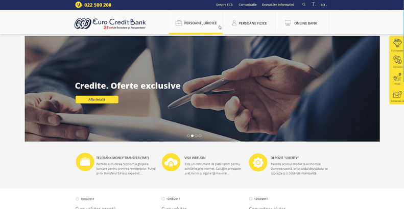
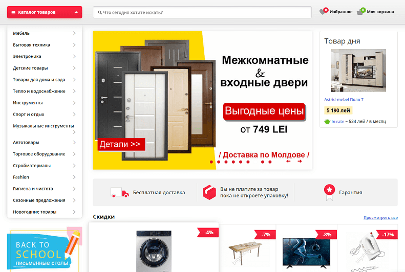
It is not a secret that the color combination for the site has a great significance, and also it contributes directly to the creation of the company's corporate identity. The same model of one web page that is done in different color combinations, can be perceived by the user differently: one color combination will attract the attention, and the other one, on the contrary, will push people away, even though the other elements of the design will be the same.
In the process of creating website design part of one web page, it is important to question ourselves what emotions we want to produce: trust in your product, which means it can be bought without hesitation, or to make a “strident” accent on the promotional offer? Or, maybe it is the case to create a peaceful, trustworthy atmosphere on the site, the user being comfortable to be on the site for a long time in the search of necessary information. Before deciding on the color combinations for the site, you need to decide firstly what reaction and emotions you want to receive from the users.
The question of color selection, on its own, depends on many factors. Here, it is essentially not only to pay attention to the meaning of the color, but there are also and other factors that decide the color palette of the site:
theme (it means to what product or service is dedicated the resource);
type (online shop, corporate site, site business card, landing, and others);
target audience (to whom you will sell your products, services);
Regarding the color combinations used for call to action buttons (order, buy, register, follow, etc.), to increase the number of conversions, there isn't a special color.
“Speaking exclusively from our practice, we get the following situation. As a rule, the visual part of the site depends on the corporate identity of the customer’s company (90%), the colors of its logo and brand book, if there is any. It means, that in order to accentuate some elements, it is used the most vivid color from the given color palette. If, for example, the color palette is monochrome or pretty pastel, to accentuate something you can add a sided shade, but its choice any way will depend on the main color combinations,” — comments Iacovleva Marina, the leader of design department in Studio Webmaster.
In this way, the selection of color palette of the site needs a complex approach and deep analysis of the field.
Regarding the theme of color theory there are many articles, books, where is described the meaning of each color individually, and the rules of their interaction with each other. Of course, these basic concepts are taken into account in the creation of professional web design, but they are used in combination with the above factors.
Because each color has its psychology, then the theme of web design will largely determine its color combination. For example, the predominance of black color talks about sophistication, style and elegance.


Blue — the color of safety, stability. It creates the atmosphere of confidence. For these qualities, it is used on medical, banking sites, for example.

If we talk about Dalmors.md (resource dedicated to fish production), the theme itself defined the color:

Green — symbolize purity, environmental friendliness, freshness. It is used frequently in the design of the sites that are specialized in organic products, food, flowers, and others:

Red — for some people it is perceived like the color of violence, and for others — the color of passion. But, not important how you regard this color, because in the end what remains true is the fact that: the red color effectively attracts attention, that is why, it is frequently used for online shops, not as a general background, but as a way to focus users attention. Namely, on these internet resources the main task is — to sell.


The visual part of a web page decides many things: how much time the users will be on the site, what things will attract their attention, what and how much they will buy, will they return for the second, third time. Also, the design closely intertwines with the technical part of the question: If you had a brilliantly designed main page and category pages, this won't bring any profit if the site is loading slowly or the links of red buttons lead to inappropriate pages.
The task of each business — to bring profit, which means you don't need to underestimate the importance of the visual part of the site. That is why we recommend ordering the web design development from professionals, who can provide a portfolio with successful works and a guarantee in the form of a contract. Otherwise, you risk getting an unpopular and unprofitable resource, even if it sells really high quality goods.
Leaders in the IT market |
| 14+ years of experience and innovative solutions to help your business stand out and grow. |
Inspiring portfolio |
| 150+ successful projects: from sleek landing pages to complex corporate systems. |
Team of experts |
| 51+ professionals who bring your ideas to life with maximum efficiency. |

| NOTORIUM TRADEMARK AWARDS |
| Notorium Trophy 2017, Notorium Gold Medal 2018, Notorium Gold Medal 2019 |

| TRADE MARK OF THE YEAR |
| Gold Medal 2016, Gold Medal 2017, Gold Medal 2018, Gold Medal 2019 |

| THE BEST EMPLOYER OF THE YEAR |
| According to the annual Survey conducted by AXA Management Consulting - 2017, 2018, 2019 |