
Have you ever visited a website on your phone and had to zoom in just to read the text? That’s where adaptive design comes in. But what does adaptive design mean for modern websites? Simply put, it’s a methodology that allows a website to respond and adjust to the different screen sizes and resolutions of various devices, providing a seamless user experience. Modern users, whether they are browsing through their laptops, tablets, or smartphones, expect websites to look and function well on any screen. In fact, studies show that over 50% of internet traffic now comes from mobile devices. This makes adaptive design not just an option but a necessity! ⭐
Think about it: Would you prefer to read a neat, well-structured site on your device or one that forces you to scroll and zoom? Clients tend to be drawn to websites that offer an enjoyable experience. Imagine youre a business owner, and your website is the face of your brand. An unattractive, cluttered site can turn potential customers away in seconds. On the flip side, with a well-executed adaptive design, your visitors will feel catered to, enhancing their experience and consequently increasing your conversion rates. ⭐
Adaptive design employs multiple pre-set layouts for different device sizes. Unlike responsive design, which uses flexible grids and media queries to adjust, adaptive design detects the visitor’s device and serves the most suitable layout. This means when someone visits your site on a smartphone, they see a mobile-friendly version, while someone on a desktop enjoys a more comprehensive layout. Let’s explore:
Let’s look at how adaptive design has transformed businesses. Take the example of a small clothing retailer who struggled with low sales due to an outdated website. After implementing an adaptive design, not only did their website become visually appealing, but it also led to a 30% increase in sales within just a few months! Customers appreciated the easy navigation and fast loading times on their mobile devices, turning casual browsers into loyal buyers. ⭐
Investing in adaptive design also enhances your SEO efforts. Google rewards mobile-friendly sites with higher search rankings. By adopting adaptive design for your site, you make yourself more visible online. According to recent statistics, sites tailored for mobile can grab over 65% more organic traffic compared to those that are not optimized. This keeps visitors returning, as they appreciate seamless interactions. ⭐
Ready to enhance your website with adaptive design? Our team at webmaster.md is here to help! With over 20 years of experience and a dedicated team of specialists, we offer all services in one place—from website redesign to technical support. Contact our customer relations manager, Arsenii, today at +373 601 066 66 or visit webmaster.md to get started, and transform your online presence! ⭐
| Device Type | Adaptive Layout Example | Key Features |
| Smartphone | Compact view with touch-friendly buttons | Fast loading time, easy navigation |
| Tablet | Two-column layout for broader viewing | More visuals, split sections for engagement |
| Desktop | Full layout with multiple features displayed | Comprehensive navigation, detailed visuals |
| Smart TV | TV optimized display | Large, clickable buttons for remote navigation |
| Wearable Devices | Simplified, functional design | Quick access to core functionalities |
Dont wait until your online presence suffers or impacts your business. Order adaptive design from us today—your website will not only look stunning but will also perform at its best across all devices. Lets start your journey towards a captivating online experience!
⭐ Interested in learning more? Reach out to us today!
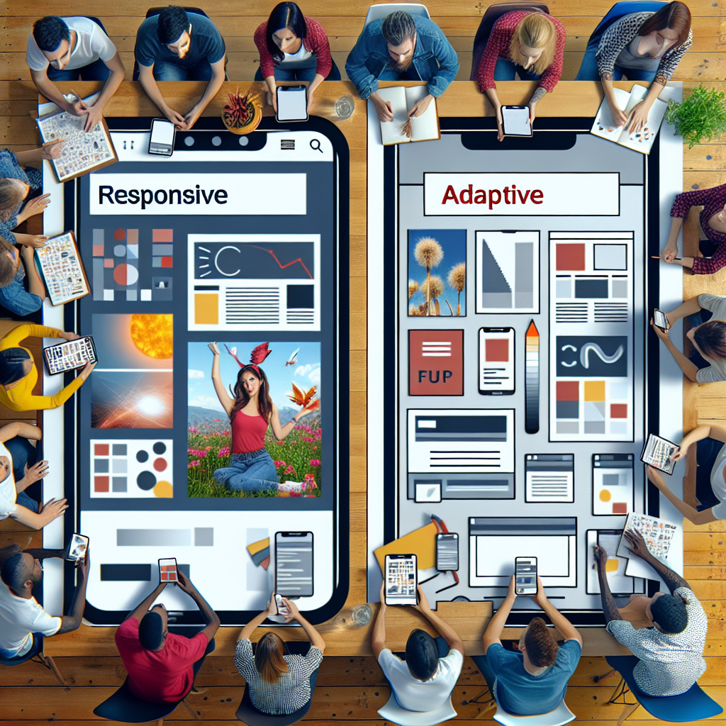
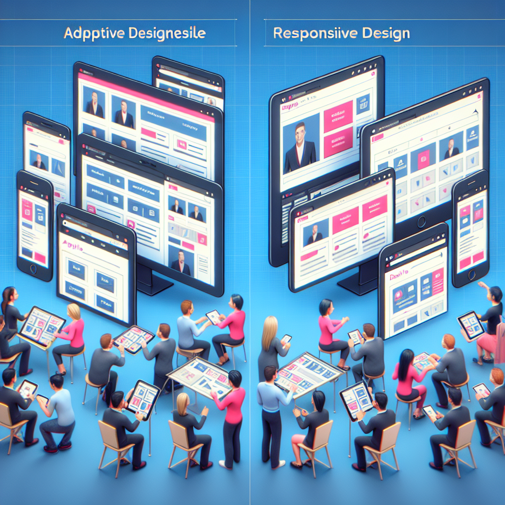
Ever found yourself puzzled by the terms responsive design and adaptive design? Youre not alone! Both are essential web design techniques aimed at enhancing user experience, but they achieve this in very different ways. Lets break it down and explore how these two approaches differ, using some relatable examples along the way. ⭐
Responsive design is all about flexibility. Imagine you’re reading a blog post on your smartphone, and as you rotate the device, the content resizing seamlessly to fit the screen is what responsive design does best! Using a fluid grid system, the elements on the page adapt proportionally to any screen size. No matter what device you use, the layout will smoothly adjust, making it a favorite among web developers.
Adaptive design, on the other hand, takes a more tailored approach. Rather than relying solely on a fluid grid, adaptive design uses pre-defined layouts for various screen sizes. It recognizes what device you’re using and serves you the most appropriate version of the site. Picture it like bringing a customized gift for each friend—different options based on their preferences! ⭐
Let’s dive deeper into the main distinctions between these two methodologies:
Let’s look at a couple of real-world scenarios to help illustrate these differences.
Imagine you own a travel agency. If you utilize responsive design, a user searching for a vacation package on their smartphone experiences a site that adjusts its layout fluidly, maintaining functionality and readability. However, the detailed images and content may not always be optimized for mobile users, potentially leading to less engagement.
In contrast, with adaptive design, that same user could see a tailored version of the site specifically designed for their device. This version could highlight easy navigation buttons, a streamlined booking process, and concise information that’s easier to digest on a small screen, which can lead to higher conversion rates. ⭐
Choosing between responsive and adaptive design depends on your specific business needs. If your focus is on creating a more personalized experience, adaptive design may be the way to go. If you want a simpler development process with great functionality, then responsive design can serve you well.
Want help figuring out which design approach is best for your website? At webmaster.md, our team of professional specialists is dedicated to helping you choose the right solution tailored to your business needs. Connect with us at +373 601 066 66 or visit webmaster.md today! ⭐
If you’re diving into the world of web design, you may have stumbled upon two main methods: adaptive web design and responsive web design. While both aim to provide an optimal viewing experience across devices, today we’ll focus on uncovering the advantages of adaptive web design over its responsive counterpart. Why might you choose adaptive design for your business? Let’s explore! ⭐
One of the standout features of adaptive web design is its ability to offer a customized user experience. This design method serves specific layouts based on the device being used, which means users will see a version of your website that looks and feels just right for their screen size. Think about it—when browsing on a smartphone, do you want to scroll endlessly or struggle to click tiny links? Of course not! With adaptive design, your visitors will find a streamlined, efficient experience tailored to their needs, which can significantly boost engagement rates. ⭐
Speed is essential in today’s fast-paced digital world. Research indicates that 53% of mobile users abandon sites that take longer than three seconds to load. This is where adaptive web design shines! Since it delivers device-specific layouts, the server can work smarter, serving less content and optimizing loading times for each device. For instance, a mobile user might see simpler images and fewer features, leading to faster load times without sacrificing quality. This can ultimately lead to longer site visits and a reduced bounce rate. ⭐
In the digital landscape, being found online is everything. An adaptive design approach can enhance your Search Engine Optimization (SEO) efforts significantly. Google appreciates mobile-friendly sites, and serving the right layout for the right device can improve your search rankings. With a better user experience, your visitors will spend more time on your site and are more likely to convert into customers—this is a factor Google weighs heavily when indexing your site. Studies show that sites focusing on adaptive design can achieve up to 65% more traffic from organic searches compared to poorly designed sites. ⭐
With adaptive web design, monitoring and analyzing performance becomes a breeze! Since you have distinct layouts for different devices, it’s easier to track user behavior and identify how each layout performs. This granular level of detail facilitates A/B testing and optimizations, allowing you to understand what resonates with your users most. In contrast, responsive designs blur the user experience into a single view, making it challenging to assess what works best. ⭐
While both adaptive and responsive designs require planning, once you have adaptive layouts in place, future adjustments to mobile views can often be less complex than reworking a responsive design every time you make a change. This is particularly helpful for businesses keeping their content fresh and relevant. It can lead to cost Efficient adjustments, an important factor for budget-conscious enterprises. Just imagine having someone handle mobile updates much faster and without affecting the desktop experience at all! ⭐
Let’s consider a real-world scenario. A local fitness studio decided to revamp their website using adaptive web design to cater to both gym-goers accessing it on mobile and desktops. After launch, they noted a 40% increase in online sign-ups, along with better retention rates. Users found it easy to navigate class schedules on their phones, leading to more spontaneous sign-ups. This tailored approach showed them firsthand how adaptive design could transform their operations! ⭐️♀️
Are you ready to harness the power of adaptive web design? This approach isn’t just about improving aesthetics; it’s about enhancing overall user experience, increasing loading speeds, and climbing search engine rankings, ultimately leading to higher conversion rates. At webmaster.md, our team has over 20 years of experience in creating custom web solutions tailored to your business needs. For a consultation, contact our customer relations manager, Arsenii, at +373 601 066 66 or visit us at webmaster.md today! You wont regret it! ⭐

When it comes to adaptive design, seeing is believing! Understanding how this web design technique translates into real-world applications can truly illustrate its effectiveness and potential benefits for businesses. Let’s explore some captivating examples and success stories that showcase adaptive design in action, transforming user experiences and driving significant results. ⭐
Amazon is one of the leading examples of adaptive design in the e-commerce space. The retail giant has tailored its mobile website to ensure smooth navigation and optimized shopping experiences across various devices. This means when you visit Amazon on your smartphone, you’re greeted by a layout that showcases your favorite items and suggested products without unnecessary clutter. The company’s adaptive design allows users to browse, add to carts, and make purchases quickly—all crucial features for customers on the go! ⭐
By leveraging adaptive design, Amazon has seen increased mobile traffic and higher conversion rates. In fact, studies suggest that up to 70% of their sales now come from mobile devices, demonstrating the significant impact of user-centric design.
Booking.com is another prime example, expertly utilizing adaptive design to cater to travelers looking for accommodations. When a user logs in from a smartphone, their site layout instantly adjusts to ensure a seamless booking experience. Key features, such as quick filters for room types and a speedy booking form, are readily accessible without overwhelming the user. ✈️
The results? Booking.com has successfully boosted its mobile bookings significantly—up to 45%—by offering an impressive adaptive experience. Travelers appreciate the ease of navigation, helping them find and secure accommodations faster, especially when the clock is ticking!
The New York Times has embraced adaptive design to ensure its readers receive the best possible experience, regardless of which device they choose to read on. Whether on a high-resolution desktop or a smaller tablet, the site adapts according to user needs. With a clean, uncluttered layout, readers can quickly access recent articles, opinion pieces, and multimedia content without any hassle. ⭐
This focus on reader satisfaction has resulted in a spike in both subscription and ad revenue. The adaptive design ensures that visitors stay engaged, regardless of whether they are reading a lengthy investigative article or scanning for highlights during a busy commute.
Zalando, a prominent online fashion retailer in Europe, employs adaptive design to offer personalized shopping experiences across devices. When users visit Zalando’s mobile site, they are presented with tailored recommendations based on their preferences and prior purchases. The adaptive approach optimizes product displays, ensuring that high-quality images of clothing and accessories load quickly while staying visually appealing. ⭐
This design strategy has proven effective, with Zalando reporting a rise in user engagement and significantly increased conversion rates among mobile shoppers. Customers appreciate the seamless interaction, making it easier to find and purchase the latest fashion trends.
These real-world applications of adaptive design highlight its effectiveness in various industries, offering improvements in usability, accessibility, and overall user satisfaction. As more businesses recognize the benefits of tailoring experiences to device specifications, embracing adaptive design becomes increasingly vital to remain competitive in the digital landscape. ⭐
Wondering how to take your website to the next level with adaptive design? At webmaster.md, our skilled team can help you create a personalized web experience tailored to your audience, regardless of the device they use. With over 20 years of experience, we’re ready to support you in boosting your online visibility and driving conversions. Contact us at +373 601 066 66 or visit webmaster.md today to get started on your web transformation journey! ⭐
Leaders in the IT market |
| 14+ years of experience and innovative solutions to help your business stand out and grow. |
Inspiring portfolio |
| 150+ successful projects: from sleek landing pages to complex corporate systems. |
Team of experts |
| 51+ professionals who bring your ideas to life with maximum efficiency. |

| NOTORIUM TRADEMARK AWARDS |
| Notorium Trophy 2017, Notorium Gold Medal 2018, Notorium Gold Medal 2019 |

| TRADE MARK OF THE YEAR |
| Gold Medal 2016, Gold Medal 2017, Gold Medal 2018, Gold Medal 2019 |

| THE BEST EMPLOYER OF THE YEAR |
| According to the annual Survey conducted by AXA Management Consulting - 2017, 2018, 2019 |