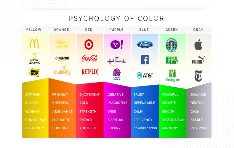
Selling effectively online is a true art of persuasion. When we sell something on the Internet, many things serve as persuasion mechanisms: the design, an easy navigation on the site and ease of interaction with the information presented, the selling texts, the page loading speed, beautiful product photos, and much more.
But the decisive factor is precisely the visual perception: according to conducted research, over 93% of consumers make a decision to buy a new product precisely because of its appearance, and only 6% find tactile sensations more important. One way or another, 85% of all buyers, when choosing various products, are guided primarily by its color (according to KISSmetrics infographics).
So is a certain combination of colors in advertising and the website design capable of increasing buying activity? Sure! To do this, you should study your target audience in great detail (gender, age, social status, average income, etc.), as well as the meaning and influence of colors. By making changes to the corporate identity of the company, to the design of the packaging of products or the website, you can significantly increase not only the number of orders, but also the average check. How? Let's take one at a time.
Color is a powerful design tool, but it is also highly personalized. For example, the colors that most often persuade US residents to buy can leave Indian buyers completely indifferent.
The influence of color on sales correlates with three conditional groups of consumers, which are divided according to their behavior at the time of shopping:
Impulsive buyers
Thrifty buyers
Traditional or casual shoppers
The trigger (the factor that provokes to buy) for impulsive buyers is usually red, orange, bright blue and black. Under their influence, impulsive people most often participate in sales and buy fast food.
For budget-conscious buyers, the trigger is dark and rich shades of blue and blue-green. Such calm and at the same time noble shades can be seen on web portals dedicated to finance and the B2B market.
Traditional shoppers represent the largest consumer group. They are exposed to all kinds of shades of blue and dark blue, pink. That is why these colors are most often used in the design of online stores for women's clothing and not only.
Red. An energetic yet aggressive color that promotes an increased heart rate. It is often chosen for sales due to the "urgency" effect.
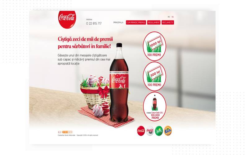
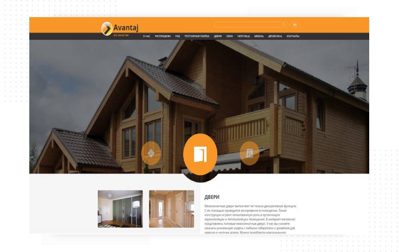
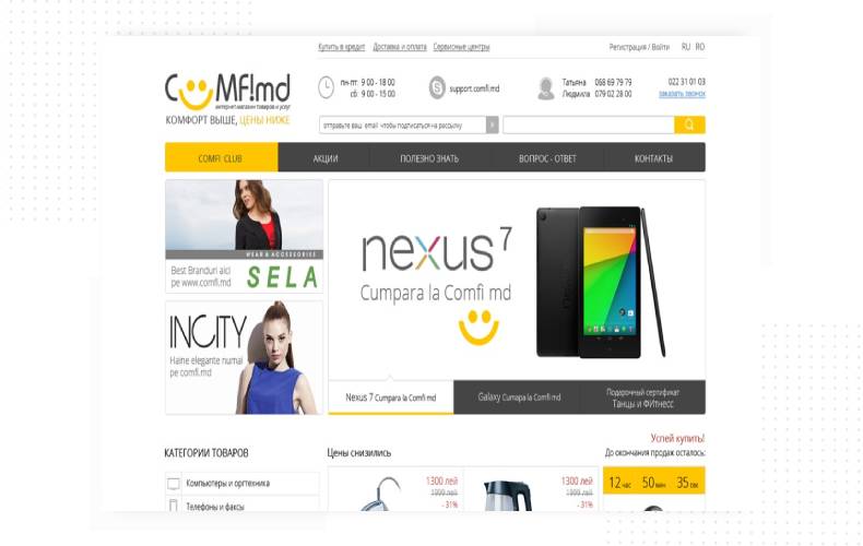
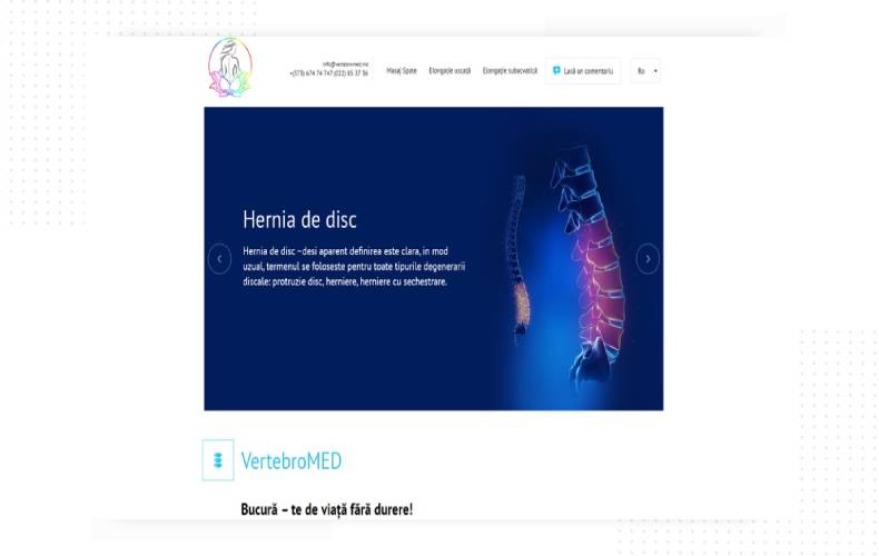
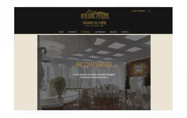
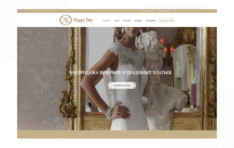
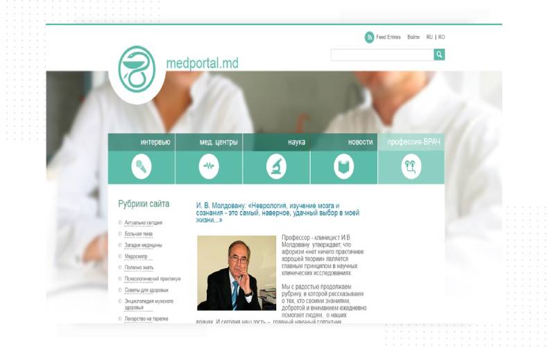
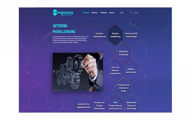
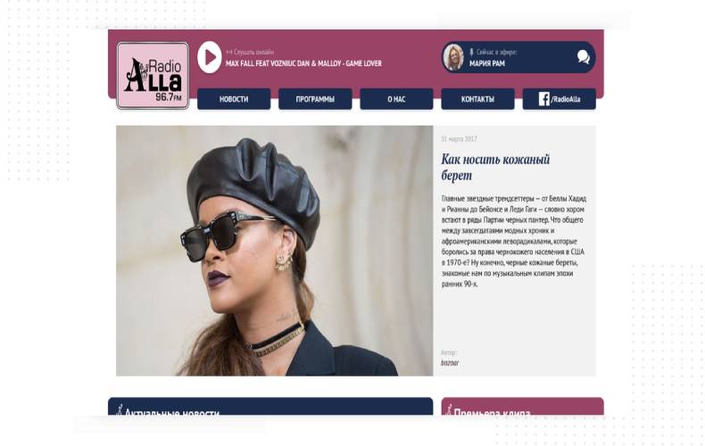
The right color for a website design is like the cherry on the cake. But just because it tastes good doesn’t mean that the whole dessert will as well. If your portal has a cool combination of shades in accordance with the characteristics of your target audience, but there are drawdowns in other parameters, most likely you will not see a positive effect on sales.
Usability
Online shoppers, like other Internet users, value the convenience of interacting with web portals (intuitive navigation, bright titles, useful texts, beautiful photos, etc.). More than 50% of visitors never return to a website if they don't like it from an aesthetic point of view or find it uncomfortable.
Page loading speed
This is also an important indicator that directly affects sales. If the transition to your online store takes only a couple of seconds longer than to the competitors' website, this can lead to significant losses. According to statistics, 64% of Internet buyers refuse further interaction with the resource because of its slow operation.
By the way, experts from Amazon.com conducted their own research and found that a decrease in website loading speed by just 100 milliseconds reduces sales by 1%.
The colors that sell work best in conjunction with ... the words that sell. They are the tool that "squeezes" the site visitor, and he has no choice but to place an order.
For example, customers are more willing to go to an online store and “walk” through it if the word “Sale” is written in large and enticing letters in an advertisement, mailing list or on the main page of the site (54% of Internet users confirmed this).
If the offer to purchase is accompanied by the words “guaranteed to receive ...” or “we give a guarantee”, this increases the chance of purchasing a product / service by 60%.
The psychology of color in advertising says that even the call to action buttons, namely their color, affect customer activity. In design, it is believed that for such website elements it is optimal to use blue, green, yellow or red, but only if the buttons are somehow highlighted against the general background.
Choosing a successful color scheme for the call-to-action buttons (seemingly such a minor change) can increase conversions by 9%! But here it is worth clarifying that for each site the optimal color scheme of CTA buttons is selected exclusively individually.
Colors in marketing have a tremendous impact on sales: whether the visitor likes the resource, whether they are interested in the product, whether they want to make a purchase and then come back again - it all depends on the right colors, shades and their combinations.
It's important to understand who your potential customers are: are they impulsive, reserved, frugal, or wealthy? When choosing a color palette for a website, web designers rely a lot on this information to make it truly sellable.
But do not forget about other indicators of a “good” website: responsive design, fast page loading speed, convenient and understandable navigation - all this should be the default, otherwise the selling effect of the color scheme will not work.
You can use all the information from this article for your own purposes, for example, if you decide to develop a logo and corporate identity online, without the help of specialists.
Leaders in the IT market |
| 14+ years of experience and innovative solutions to help your business stand out and grow. |
Inspiring portfolio |
| 150+ successful projects: from sleek landing pages to complex corporate systems. |
Team of experts |
| 51+ professionals who bring your ideas to life with maximum efficiency. |

| NOTORIUM TRADEMARK AWARDS |
| Notorium Trophy 2017, Notorium Gold Medal 2018, Notorium Gold Medal 2019 |

| TRADE MARK OF THE YEAR |
| Gold Medal 2016, Gold Medal 2017, Gold Medal 2018, Gold Medal 2019 |

| THE BEST EMPLOYER OF THE YEAR |
| According to the annual Survey conducted by AXA Management Consulting - 2017, 2018, 2019 |