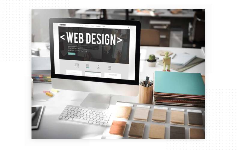
A good web design is not just a result of a specialist's fantasies, it is the usability of a website design, because usability is primarily determined by the user. Quality visuals are based on the color psychology, on the target audience preferences and the strict design guidelines. First of all, it is people-oriented. But what does that mean?
Internet users are impatient: in the search results they click on one of the first links, and if they do not find what they were looking for, they immediately close the site and open another. A good website design not only retains the attention of a potential client, but also allows them to quickly and conveniently interact with the information presented.

The first impression
It is rendered to the greatest extent by the home page of the website, therefore the most attention is paid to it: optimized enticing texts, high-quality images that do not distract from the main information, pleasant colors for perception. If at the stage of navigating the main page it was possible to win the user’s attention, then the main job is done.
The accents
Modern web resources usually contain static and dynamic content, so it is very important to correctly highlight what the user should pay attention to first. Moving objects, bold print, and other visual cues help the visitor arrive at the final search destination correctly and without hesitation.
Structure
Nice design and hierarchy allows you to understand in a short time what functions are available and how to work with the resource. A content that is easy to read is one of the most important principles of a successful design.
Simplicity and conciseness
Accessibility and convenience always attracts the Internet user, because they do not visit the website just to admire the design. A good visual is when you immediately find the navigation bar, the content and the titles, the links on the topic, and you can place an order without any problems.
Space
Do not overload the page with unnecessary graphics. The content should be divided into parts so that it is convenient for the user to analyze, search for information and work with it. If there is a choice between graphics and blank space, then it is better to give preference to the latter. Empty blocks with a nice background are a place where you can “take a breath” and make the right purchase decision.
Still have questions on the topic? Contact the Studio Webmaster specialists and get a free expert consultation.
Order
Leaders in the IT market |
| 14+ years of experience and innovative solutions to help your business stand out and grow. |
Inspiring portfolio |
| 150+ successful projects: from sleek landing pages to complex corporate systems. |
Team of experts |
| 51+ professionals who bring your ideas to life with maximum efficiency. |

| NOTORIUM TRADEMARK AWARDS |
| Notorium Trophy 2017, Notorium Gold Medal 2018, Notorium Gold Medal 2019 |

| TRADE MARK OF THE YEAR |
| Gold Medal 2016, Gold Medal 2017, Gold Medal 2018, Gold Medal 2019 |

| THE BEST EMPLOYER OF THE YEAR |
| According to the annual Survey conducted by AXA Management Consulting - 2017, 2018, 2019 |