Banner advertising from Studio Webmaster is a special graphic element on the website. It can be either static or animated. The goal is to encourage the user to read the message. When the user clicks on the banner, they are taken to the promoted page. It is one of the most popular and oldest forms of online promotion. Website banners are usually placed at the top of the page because this part is most attractive to users.
For your information, the first advertising banner on the Internet was released on October 27, 1994.
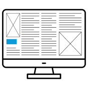
Over time, more modern forms have appeared: expandable or floating banner. Other types of display ads were invented, for example, a side banner (skyscraper), middle block, or button.
In case you are deeply interested in this topic, all you need to do is visit any website with advertising content. Everywhere you can find at least a single web banner. Although this type of advertising has been around for many years, its popularity has never declined. There is a reason wh
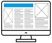
Traditional banner - rectangular ad placed at the beginning of the site. It can be floating. Then the banner does not change its position, even if the user scrolls the page. There is also an expandable banner. When the user hovers over it, it grows in size, allowing additional information to be displayed. The standard size of the traditional and floating banner is 468x60 pixels, and the expandable banner is 468x240 pixels.
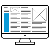
Skyscraper advertising in the form of a rectangle, placed in most cases on the right side of the site, but it can also appear on the opposite side. The standard size is 120x600 pixels. As with the traditional banner, the skyscraper also has an expandable shape (up to 320x600 pixels) and a floating shape.
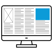
Rectangle An image ad that is placed in the center of the page, usually within the text. It has 2 standard sizes: 180x150 pixels and 336x280 pixels. The intertextual field is most often used on websites with a large amount of text because it helps the user notice the words.
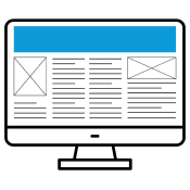
Billboard (aka megabanner) - the largest advertising banner at the top of the site. The usual billboard size is 620x100 pixels. In addition to the standard version, there is also an expandable (increases to 750x200 pixels) and floating megabanner.
Button - advertising in the form of a small rectangle. Its standard size is 120x60 pixels.
The above ad banners can be created in the following formats: jpg, static gif, animated gif, rich media, flash and html.
Advertising banners on the Internet also usually include:
Interstitial ad- an advertisement in the animated form, displayed to the user throughout the site. The animation lasts no more than 15 seconds, after which it should close by itself. After all, the interstitial ad should also have a self-disconnect feature.
Brand logo- advertising that resembles a player, but usually does not have a transparent layer. It can take almost any shape.
In principle, this is not difficult. Yet creating clear, compelling banner ads at the best price requires professional expertise. There are a few basic rules to follow. They will allow Internet users to become interested in your banner and will not give them the opportunity to perceive it as a hindrance.
The web banner must graphically correspond to the page it links to. And to match the visual design of the brand - so that the colors, slogans and fonts will not leave anyone indifferent. As for the graphic design itself, it should not strongly resemble the classic advertising. Sometimes the success lies in the fact that the image does not look quite typical.
Keep it simple. A riot of colors and a very dynamic animation often annoy the Internet audience, and they have a negative attitude towards such advertising from the very start. At times, it's helpful to design internet banner ads that are graphically muted, with clear, legible slogans and a clear call to action. It makes sense to display the banner title in the same way.
And yes, there should be emphasis on the call to action. The effectiveness of a banner is determined by its click-through rate. Therefore, it is important to encourage users to take specific actions. The dynamics are always captivating. We will place a slogan in its content, and this will induce the online user to do what the owner of the commercial resource needs.
The interactivity of the banner on the website will surely attract the attention of web users. It is best to choose an original animation or try to entertain the visitors with an interesting game.
Pay attention to the content, not just the form. A good proposal must be combined with a positiveness. If you want to effectively promote yourself, positive emotions in the content of your banners will always help you with this. However, do it in a clear and understandable way, without unnecessary metaphors.
Be careful where to place your banner as an advertisement at a normal price. Check who are the visitors and regulars of the page you want to put it on. After this step, feel free to order the appropriate service from Studio Webmaster, taking into account their interests and audience requirements. In turn, we will readily help you analyze the results of tracking clicks on websites and find out what attracts the most attention of resource users. Also remember that large banner ads are clicked much more often than small ones. The first option is easier for netizens to remember.

You choose the location and frequency of your ads. At the same time, the banner should not distract visitors from the main content. Also, the ad unit should not deceive the audience so as not to lose it.

Banners must be fully consistent with the theme of the website in order to maximize the interest of the public.

It is important to have a colorful and extraordinary banner. Beautiful animation is always to the liking of users. You should periodically change the design of the ad, because everything becomes boring over time.
If you want to create an interesting and catchy web banner, contact our specialists to realize your goal. Otherwise, your efforts may be counterproductive.
In general, a web banner is a tool that seems to be easy to create and easy to manage. However, in order to improve your marketing campaign, the banner needs to be well polished and complemented with other forms of advertising. A properly designed banner ad is the key to success, and this is what you should focus on when using this type of promotion.
A banner ad on the internet is a good choice if you go to Studio Webmaster. Our experts are ready to develop a strategy for active promotion of your brand. We guarantee an excellent result with an optimal budget.
Leaders in the IT market |
| 14+ years of experience and innovative solutions to help your business stand out and grow. |
Inspiring portfolio |
| 150+ successful projects: from sleek landing pages to complex corporate systems. |
Team of experts |
| 51+ professionals who bring your ideas to life with maximum efficiency. |

| NOTORIUM TRADEMARK AWARDS |
| Notorium Trophy 2017, Notorium Gold Medal 2018, Notorium Gold Medal 2019 |

| TRADE MARK OF THE YEAR |
| Gold Medal 2016, Gold Medal 2017, Gold Medal 2018, Gold Medal 2019 |

| THE BEST EMPLOYER OF THE YEAR |
| According to the annual Survey conducted by AXA Management Consulting - 2017, 2018, 2019 |